Sky Watch Page
Role / Services
UI design
Role / Services
UI design
Role / Services
UI design
Year
2025
Year
2025
Year
2025
The Opportunity
The original Sky Watch page, like the Sky Kids page was cluttered, carousel-heavy, and suffered from serious engagement drop-off. Internal testing showed most users didn’t scroll beyond the second carousel. As Sky introduced new TV packages, Essential TV and Ultimate TV, the opportunity arose to transform the Watch page into something more focused, clearer, and easier to digest.
The Brief
There wasn’t a formal brief for this one. Just a request for something that felt premium, trustworthy, and aligned with the brand’s look. The goal was to give the business its own digital home: something that could be shared confidently with clients and used to help grow visibility over time.
The Opportunity
The original Sky Watch page, like the Sky Kids page was cluttered, carousel-heavy, and suffered from serious engagement drop-off. Internal testing showed most users didn’t scroll beyond the second carousel. As Sky introduced new TV packages, Essential TV and Ultimate TV, the opportunity arose to transform the Watch page into something more focused, clearer, and easier to digest.
Design Goals
The new Watch page needed to be leaner, smarter, and more functional — serving as a true content discovery hub and showcasing exactly what users get with their package tier.
Key aims:
– Reduce overwhelming content by simplifying layout and hierarchy
– Introduce distinct zones for each package offering (Entertainment, Cinema, Kids)
– Allow users to preview channel-specific and genre-based content at a glance
– Improve scannability and promote featured shows through more curated visuals
– Guide users down the page through structured content rails and logical flow
– Implement a clearer “How to Watch Sky” section for device onboarding
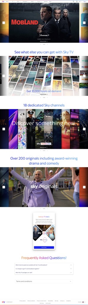
Structure Overview
– Hero Section: Rich banner showcasing standout content
– Sky Packages Breakdown: Visual comparison between Essential and Ultimate
– Channel Zones: Grouped carousels by channel to make scanning easy
– Sky Originals + On Demand: Highlighting platform-exclusive content
– Sports & Kids Preview Rails: Dedicated lanes for key genres
– How to Watch Sky: Explained by device (Sky Go, Stream, Glass etc)
– FAQs: Compact support section that addresses common queries

Why this matters
This new layout helps users quickly understand Sky’s offering without information overload. We’ve replaced bulk with clarity, carousels with context, and created a more dynamic path to discovery — all while aligning with Sky’s latest content and package rollout.
Why this matters
This new layout helps users quickly understand Sky’s offering without information overload. We’ve replaced bulk with clarity, carousels with context, and created a more dynamic path to discovery — all while aligning with Sky’s latest content and package rollout.
Design Goals
The new Watch page needed to be leaner, smarter, and more functional — serving as a true content discovery hub and showcasing exactly what users get with their package tier.
Key aims:
– Reduce overwhelming content by simplifying layout and hierarchy
– Introduce distinct zones for each package offering (Entertainment, Cinema, Kids)
– Allow users to preview channel-specific and genre-based content at a glance
– Improve scannability and promote featured shows through more curated visuals
– Guide users down the page through structured content rails and logical flow
– Implement a clearer “How to Watch Sky” section for device onboarding
See Preview